11 Aug 2026 Launch
The Making Of – Lost Fresco
The Making of Lost Fresco.
A while ago, we started work on a design inspired by an Enamel Comb. An idea sparked into life with a single photograph of a handmade comb created specifically for the then empress of a ruling ancient Japanese dynasty. Its level of preservation suggested it was ever used, but the item’s intricacy and luminosity captured our imagination.
From its original starting point and as the design evolved, the artworks and colours shifted and began to resemble something else entirely and thus the story shifted toward the idea of uncovering a hidden wall beyond a wall. Its scale also triggered the image in our minds of ancient frescos, preserved and uncovered after hundreds of years. The vocabularly that emerged through the design process was one of revealing a lost world, found. Embedded in this idea touched upon something about the creative process itself, an initial visual reference sparks a conversation and opens up curios possibilities of something entirely new.
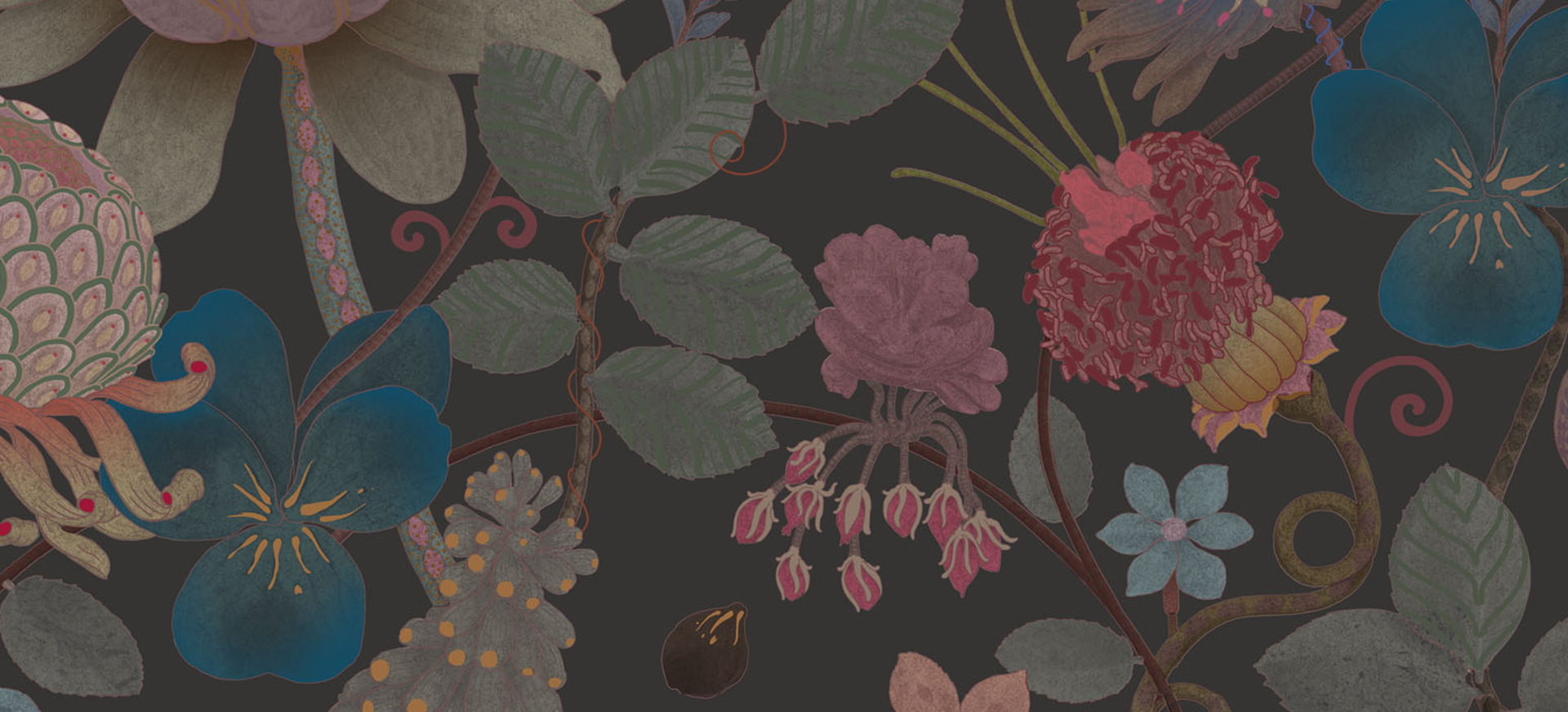
The design is intended to be filled with seed pods and intriguing flowers unfurling, creating a unique and striking decorative effect. It feels at once of today, yet its elements have been drawn from a deep understanding of historical motiefs taking from reserch trips to Londons Victoria and Albert Museum The Whitney in Manhatten.
Painted using fine horsehair brushes, the design embodies a passion for pattern. Each stem is filled with spots, stripes, and petal shapes, creating a sense of pattern within pattern as if the forms themselves are covered in ornament. This results in a rich tapestry that carries colour through the design in a distinctive way, bringing depth and an extraordinary sense of layering.
A Call to Colour
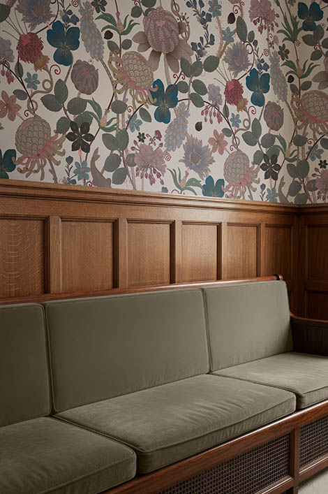
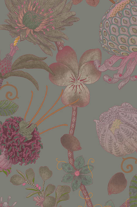
Colour sits at the very heart of Lost Fresco. Each of its colourways has been carefully developed and given a playful name, chosen to echo the layered themes and quiet narratives that run through the studio’s work. These are not colours selected to shout, but to endure to shift gently with light, mood, and time.
While we don’t play favourites, one colourway of particular note is Cerulean. This blue beauty carries a subtle nod to a certain summer blockbuster, yet remains resolutely serious about décor. It is a considered, grounded blue, elegant rather than bright, designed for homes seeking depth without dominance. In use, Cerulean brings a luminous calm to a space, changing character as the day unfolds and revealing unexpected richness in shadow and light.
Colour played a central role throughout the development of Lost Fresco, resulting in six distinctive colourways, each offering a different emotional register for the design to inhabit. We love the way each transforms the pattern in its own way, and we’d love to know which one speaks most strongly to you.
Scale, Surface & Substance
Lost Fresco is conceived as a large-scale design, realised through our distinctive super‑wide printing method allowiong our hand painted artworks to breathe at their intended scale. Each roll is produced at a custom length of up to 20 metres, with as many drops available as needed to suit the demands of a project offering both flexibility and continuity across walls.
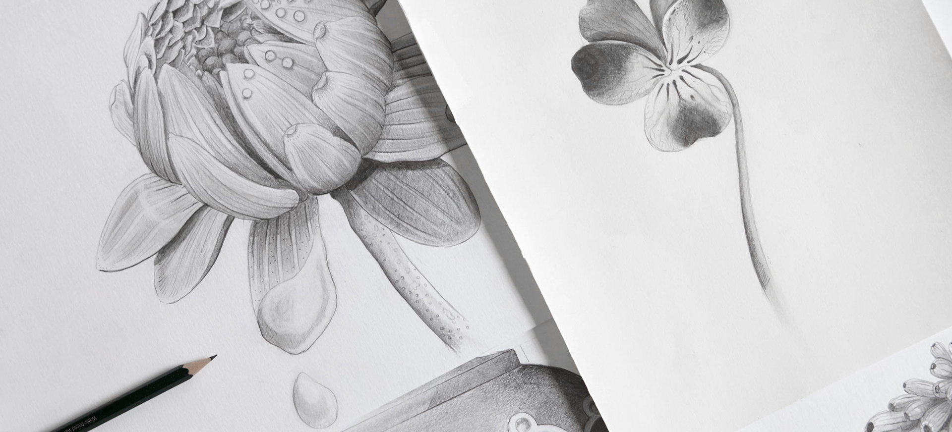
Printed using water-based inks onto a beautifully rich, matt non‑woven wallcovering, the surface has a soft, chalky depth that enhances the painterly quality of the design while remaining quietly robust. The result is a paper that not only looks exceptional, but brings strong environmental credentials to an interior, an important consideration from the very beginning of its development.
As with all of our wallcoverings, Lost Fresco reflects our commitment to responsible production and longevity. It is one of the most environmentally considered designs we have produced to date, combining durability and excellent lightfastness to ensure it remains true and beautiful over time. This is décor designed for living with and ultimately, for being handed down through generations.
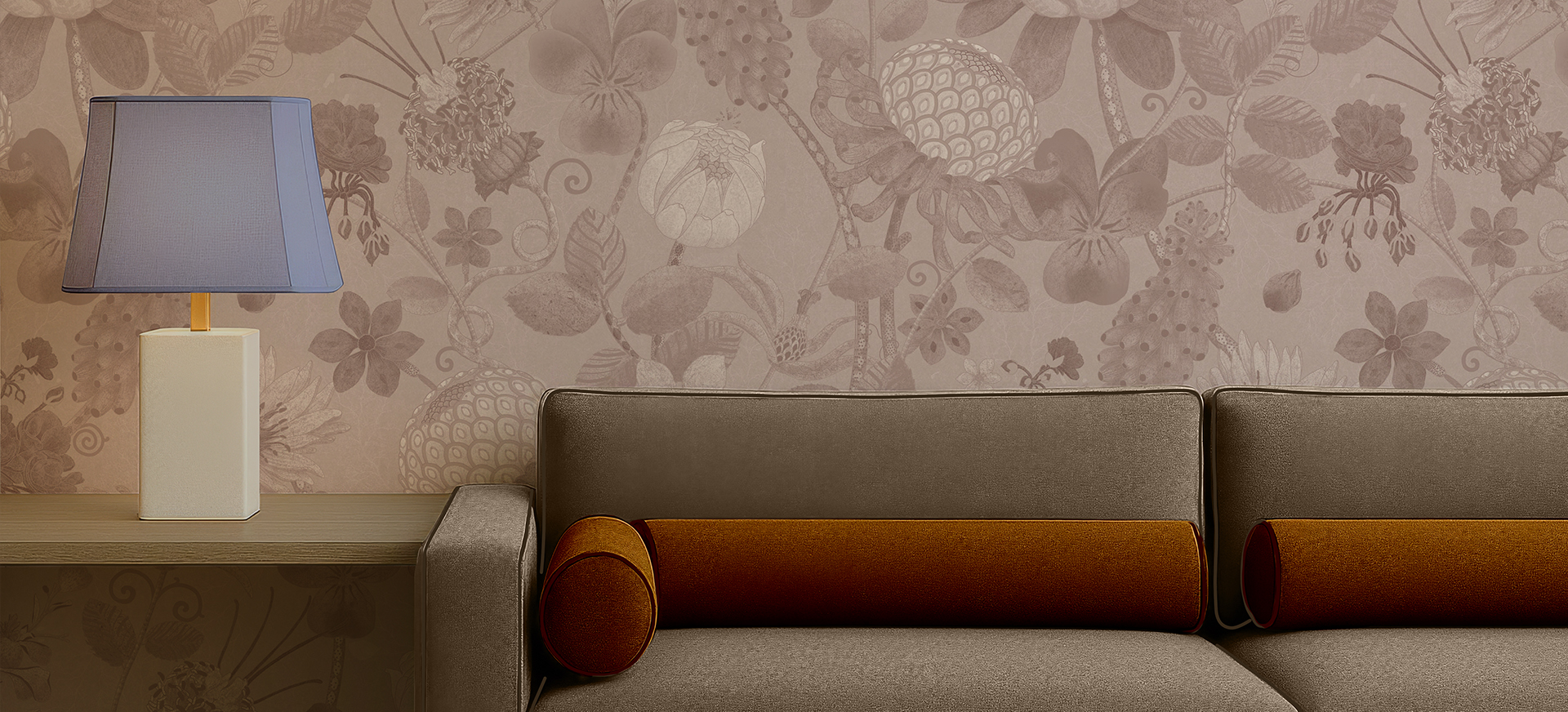
Discover the Lost Fresco Wallcoverings and many more here.
Read Other Posts
Wallcovering Cases
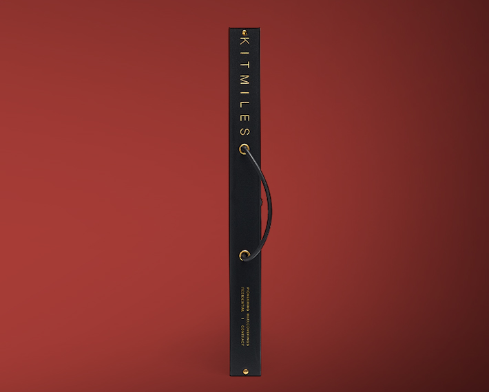
Created for design professionals and specifiers, the KIT MILES Presentation Case... Read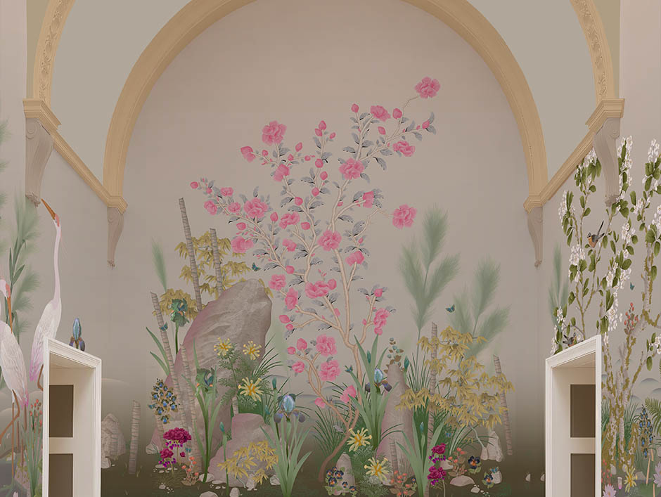
Modular Scenic Wallcoverings
Mount Horai pioneers a new methodology in scenic wallcoverings: a modular system... Read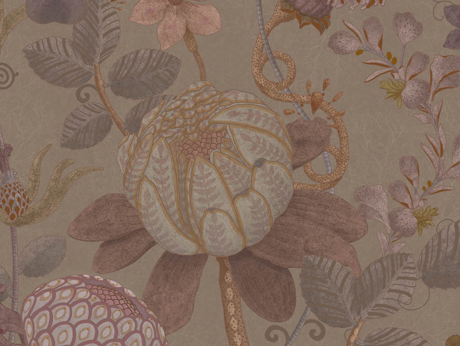
The Making Of – Lost Fresco
A while ago, we started work on a design inspired by an Enamel Comb. An idea spa... Read
Human-Powered Creativity
Some test content. Read